If you’re a regular traveller, you’ll know that changing money from one currency to another can be a constantly changing battleground. Foreign exchange rates (or Forex), change all the time, and what can seem like a good rate can disappear within days.
When I first started visiting Canada in 2001, one British pound (GBP) bought $2.35 Canadian dollars (CAD). Canada seemed cheap! However, fast forward ten years to 2011, and 1 GBP now only buys 1.59 CAD. In other words, the pound has devalued by around 30% against the Canadian dollar (and a similar amount to the US dollar). This makes my (still necessary) trips to North America much more expensive, and things no longer seem like a bargain.
This means I have to keep a much closer eye on the exchange rate in order to balance my budget. I now exchange money in advance if I think I’m getting good value. But how do I know this? I can’t tell the future – I can only look backwards.
The first step is to locate historical exchange rates. There are many websites that give you this data for any two currencies. I like Oanda.com because it allows you to download historical data in a format you can import into Excel.
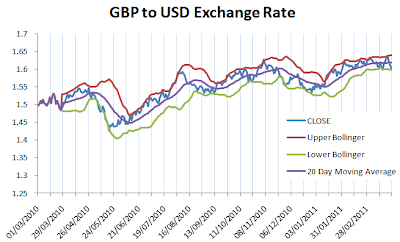
This is an Excel chart that gives the GBP-USD daily exchange rate (thats’ the blue line called CLOSE) over the last year
But there are three more lines on the chart. We have the 20 Day Moving Average, and the Upper and Lower Bollinger Bands. Bollinger Bands are equivalent to the 20-day moving average plus or minus two standard deviations)
If you examine the chart carefully, you’ll find that nearly all of the movement of the blue closing line is between the two Bollinger Bands. Let’s examine one small section of the chart in detail.
The blue line doesn’t above or below the Bollinger bands. In fact, when the blue line hits the bottom Bollinger band, it’s probably going to either drift along the bottom or go up. When the blue line hits the top Bollinger band, it’ll probably drift along the top or go down.
You can use these indicators to determine whether you’re getting a good or bad exchange rate. Now, this rule of thumb isn’t universally true – it’s only valid in a market that’s trading horizontally, without much up or down momentum.
Similar to the stock market, there are times in which Forex rates change rapidly. This is known as volatility. During periods of volatility the Bollinger bands move further apart, and vice-versa when the market is stable.
Now, some professional forex traders have drawn the conclusion that bands that get narrower indicate that the market will become more volatile in the future, while bands that get wider mean that the market will become less volatile in the future. Additionally, these traders use Forex data that’s updated on a minute-by-minute basis, not day-by-day as I have used here. This allows them to make instant trading decisions, taking advantage of small pricing movements.
Another useful indicator is the Bollinger Squeeze. This is equal to the (Upper Band – Lower Band)/Moving Average. A six month low in the Bollinger Squeeze indicates greater future volatility (whether it’s a significant up or down movement is flagpolled by other indicators).
Bollinger bands are remarkably easy to create in Excel. The STDEV() function is key – it’ll calculate the standard deviation of a data set. You can download the Excel spreadsheet I used to create the charts above by clicking here.


I do not find a downloadable Bollinger band code on this page should it be here?
https://investexcel.net/forex-bollinger-bands-and-excel
Sorry found that here after I wrote the comment, can I suggest you bold and underline that Hyperlink.