Get VBA code and a spreadsheet that automatically downloads historical stock quotes and plots a candlestick chart.
Charting is an art form. And frankly, charts can be beautiful, but still make it easy to grasp the bigger picture while capturing all of the finer detail.
One of my favorites is a candlestick chart.
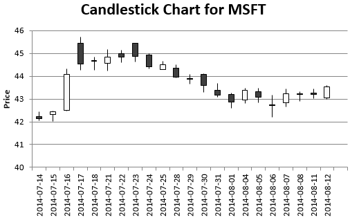
These plot the open, high, low and close price vs the date for a stock (Wikipedia offers a detailed description.)
Here’s an example for Microsoft (ticker: MSFT) between 14th July 2014 and 14th August 2014,
Excel can create candlestick charts out-of-the-box with a few clicks. But automating everything in VBA helps you create these charts much more quickly.
You can write VBA code that creates a simple candlestick chart, removing the need for most of those pesky mouse-clicks. Here’s a time-consuming code snippets (download the complete spreadsheet from the link at the bottom of this post for a complete implementation).
nRows = Sheets("Data").UsedRange.Rows.Count Dim OHLCChart As ChartObject Set OHLCChart = Sheets("Parameters").ChartObjects.Add(Left:=Range("a10").Left, Width:=500, Top:=Range("a10").Top, Height:=300) With OHLCChart.Chart .SetSourceData Source:=Sheets("Data").Range("a1:e" & nRows) .ChartType = xlStockOHLC End With |
The VBA code assumes that
- your historical data is on a sheet called “Data”,
- it’s in the order Date-Open-High-Low-Close (starting from cell A1).
- and the chart will be placed on the “Parameters” sheet.
The VBA won’t do much more than plot a basic candlestick chart. But there’s so much more you can do with a little more hacking. For example, you can give the chart a title, axis labels, and color the background with some additional VBA. Just add the following code before the End With statement
    .HasTitle = True
    .ChartTitle.Text = "Candlestick Chart for " & Sheets("Parameters").Range("ticker")
    .Axes(xlValue, xlPrimary).HasTitle = True
    .Axes(xlValue, xlPrimary).AxisTitle.Characters.Text = "Price"
    .HasLegend = False
.PlotArea.Format.Fill.ForeColor.RGB = RGB(220, 230, 241) |
I also like to remove the shape border line with this code.
.ChartArea.Format.Line.Visible = msoFalse |
I find it good practice to rename the chart as well.
.Parent.Name = "OHLC Chart" |
You can explore the many options available with the command completion down-down menu in the VBA editor.
Of course, you need historical OHLC prices, otherwise you couldn’t create a candlestick chart in the first place. Yahoo Finance is a popular source. You can either download the historical data by saving a CSV file, or you can ask VBA to automatically download historical OHLC prices.
This Excel spreadsheet downloads historical stock data from Yahoo Finance, and plots a candlestick chart.
It’s pretty simple to use, and doesn’t require much explanation. Just enter a ticker and two dates, followed by a couple of button clicks to download and plot the chart.
Feel free to view the VBA and learn from the code. It’s flexible, and you might just surprise yourself with what you can do!
Download Excel Spreadsheet to Plot Candlestick Chart with VBA


I tried to get candelstik chart of “BAJAJ-AUTO.BO” its giving error,
http://ichart.finance.yahoo.com/table.csv?s=BAJAJ-AUTO.BO&a=10&b=1&c=2014&d=10&e=13&f=2014&g=&q=q&y=0&z=BAJAJ-AUTO.BO&x=.csv
Interesting stuff you put out here. thx.
just a heads up: I found that ticker ESZ15.CME works with chartapi.finance.yahoo.com but not with ichart.finance.yahoo.com. In case you want to use SPX futures.